
Graphic Design · 2026
Eminence Equestrian Training Double Sided Business Cards
Double-sided equestrian coaching cards with a logo-led front and clear, ornamental contact layout.
Business Card Design / Branding
Behind the work
Project story
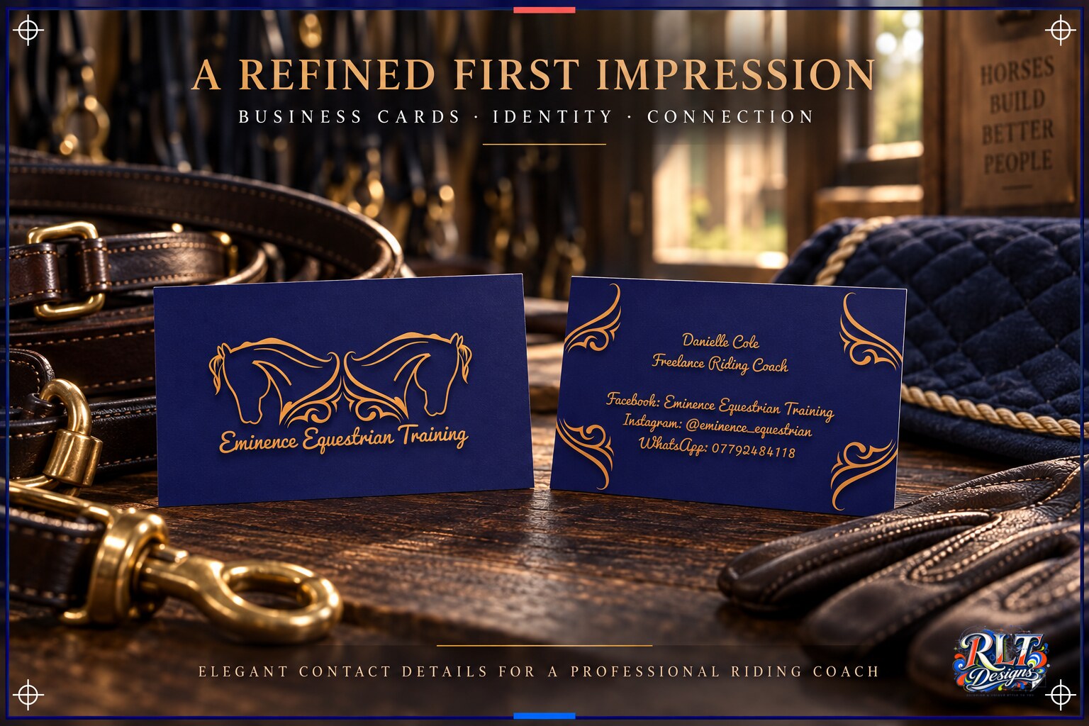
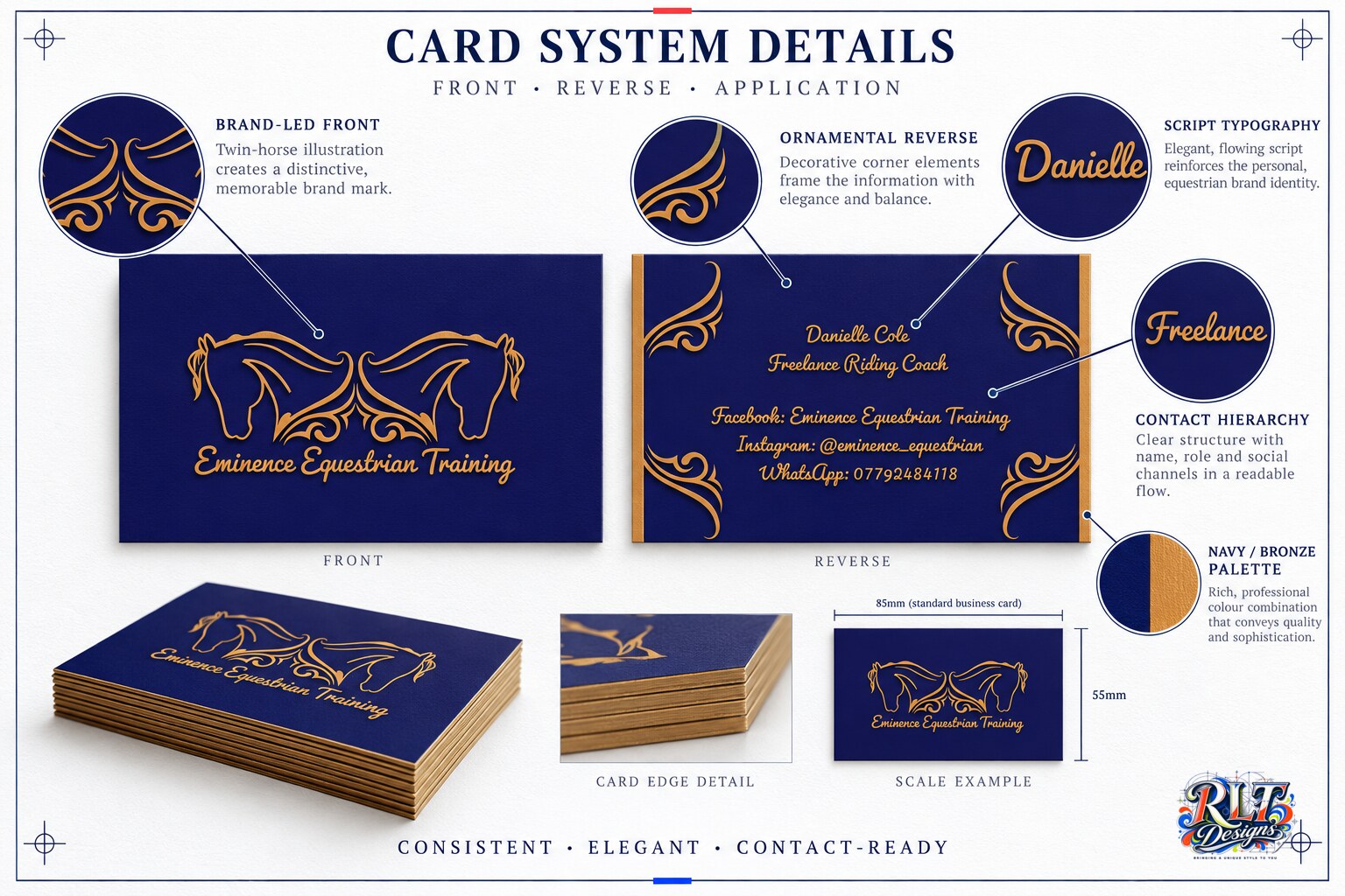
These business cards were designed to carry the Eminence Equestrian Training identity into a practical contact piece. The aim was to retain the elegance of the logo while making the coach’s name, role and social channels easy to read.
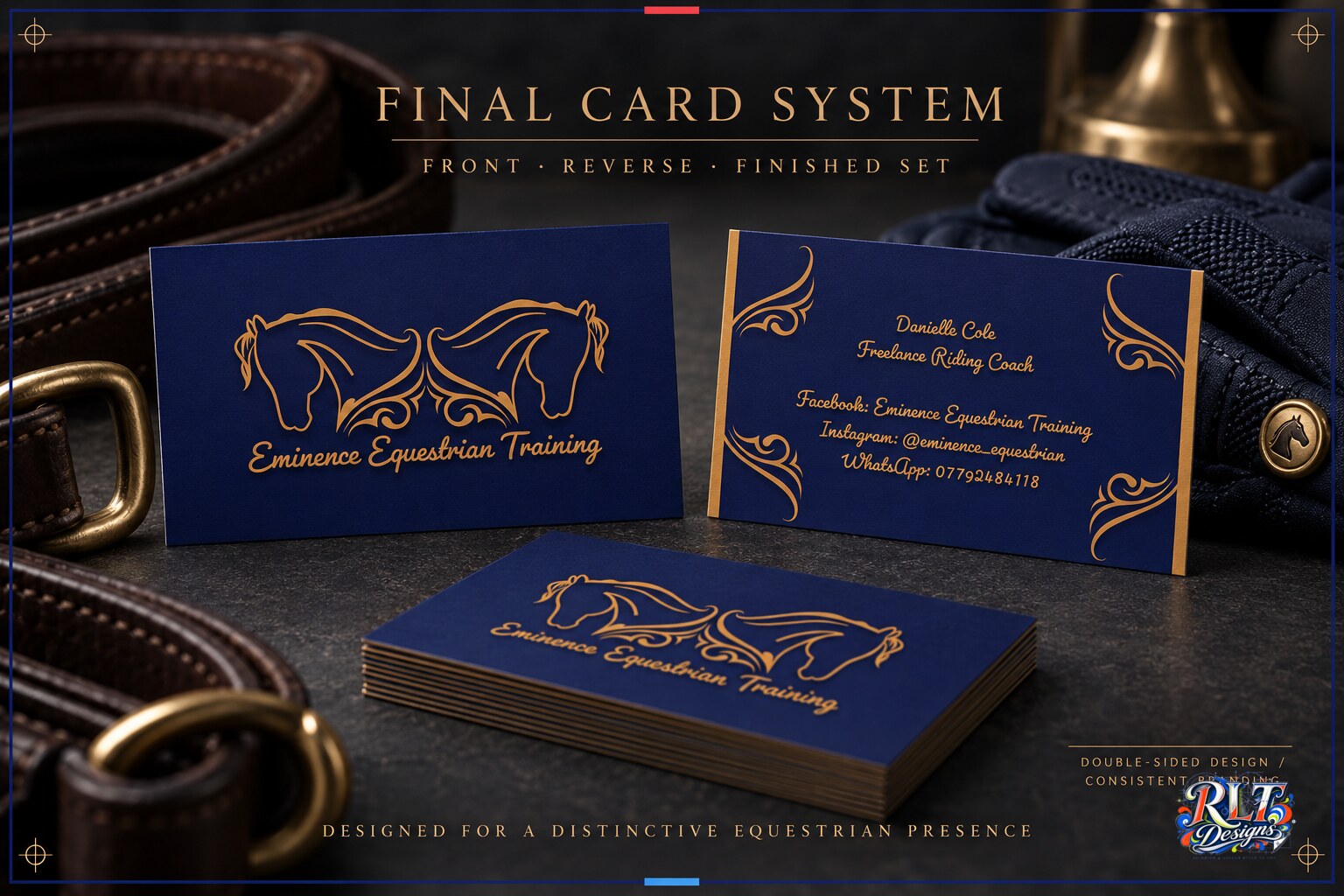
The front uses the mirrored horse illustration as the main brand feature. On the reverse, ornamental corner elements frame the information and create a visual link with the flowing logo linework. The navy and bronze palette remains consistent across both sides, while the contact hierarchy separates the name, role and individual platforms.
The completed cards provide a refined first impression without sacrificing function. They give prospective clients a clear way to retain the business details and reinforce the same visual identity used across the wider coaching brand.
Have something in mind?