
Graphic Design · 2026
Eminence Equestrian Training Logo
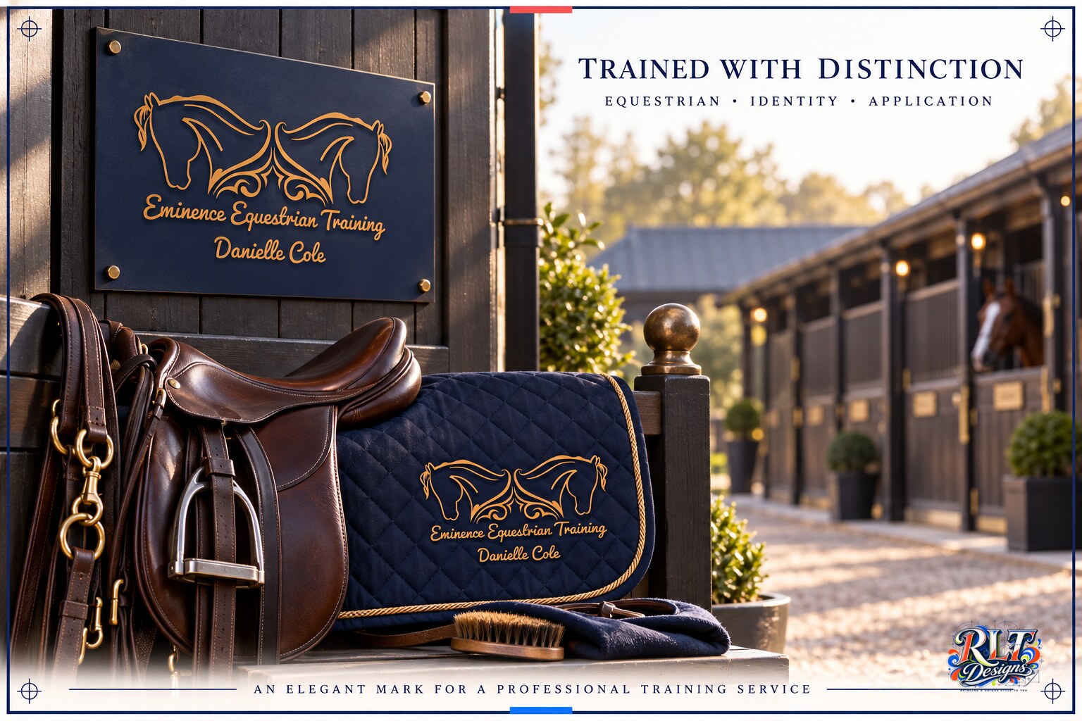
Elegant equestrian coaching identity using mirrored horse profiles, flowing linework and a navy and bronze palette.
Logo Design / Branding
Behind the work
Project story
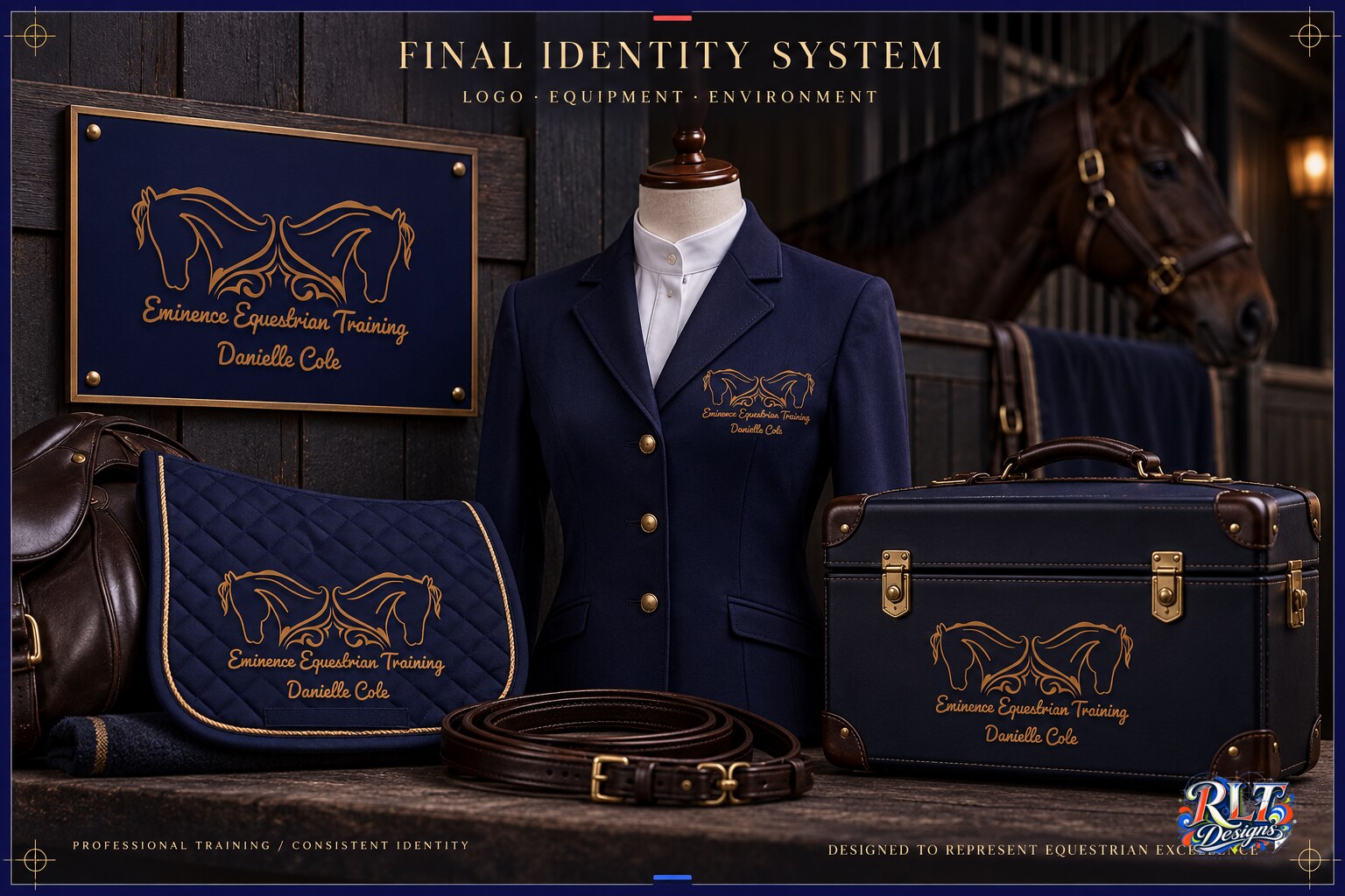
Eminence Equestrian Training needed an identity that could reflect professional riding instruction and the relationship between horse and rider. The logo had to feel elegant and personal while remaining practical across clothing, social media and printed materials.
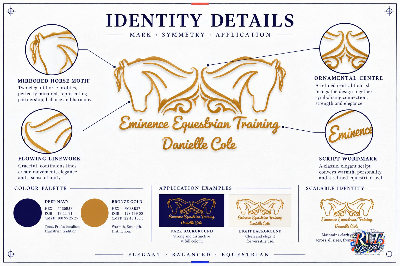
I developed two mirrored horse profiles using flowing ornamental linework. The symmetry creates balance and gives the mark a calm, controlled presence. Deep navy provides the main foundation, with bronze-gold details adding warmth and distinction. A script wordmark supports the personal nature of the coaching service.
The finished system gives the business a recognisable identity that works on both dark and light backgrounds. The central motif can also be used independently when the full name is not required, giving the brand flexibility across smaller applications.
Have something in mind?