
Graphic Design · 2026
J Cooling Logo
Commercial cooling and HVAC identity using circular airflow, technical symbolism and a blue and orange colour system.
Branding / Logo Design
Behind the work
Project story
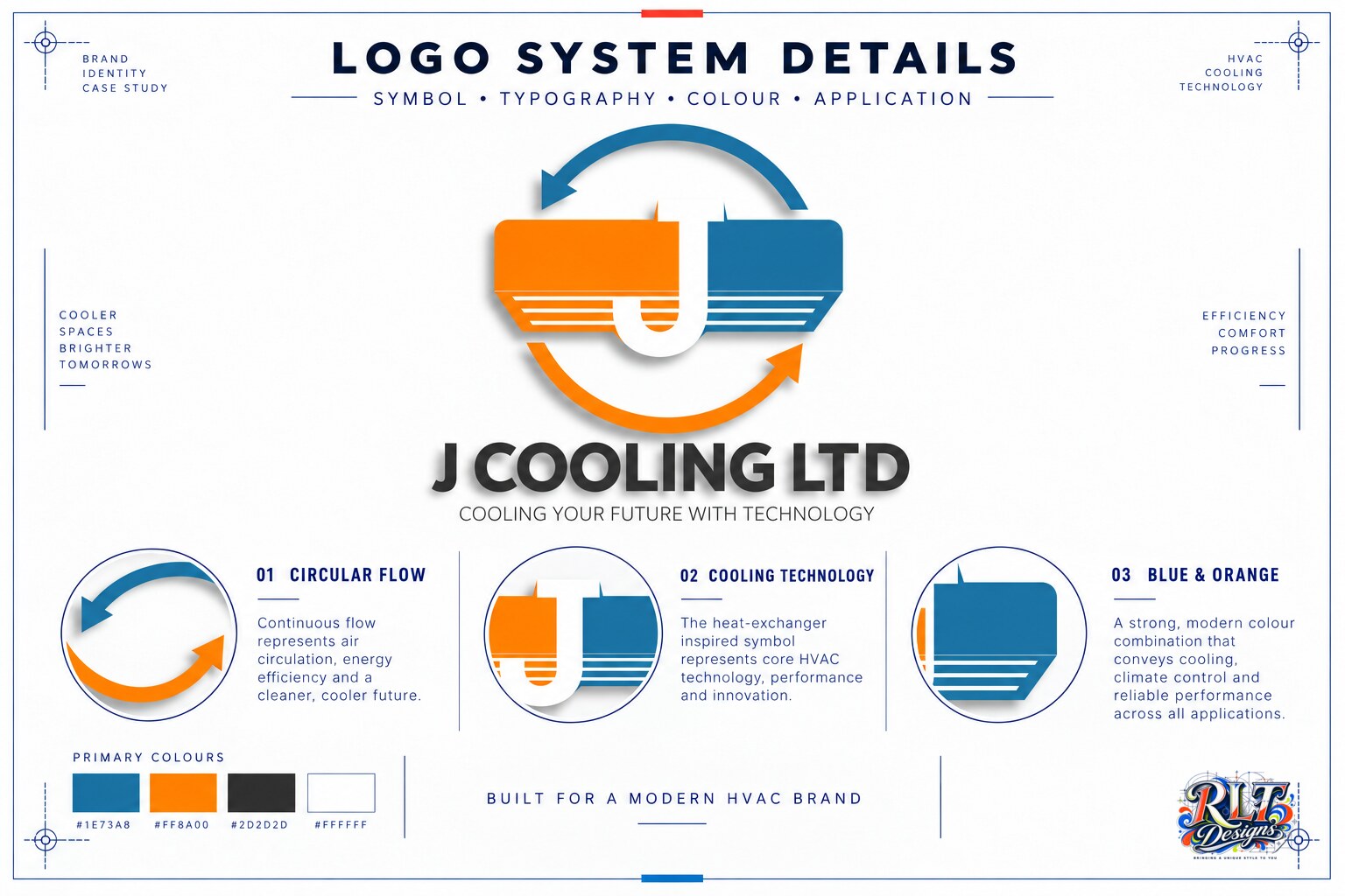
J Cooling Ltd needed a modern identity for a commercial cooling and HVAC technology business. The mark had to communicate airflow and technical performance while remaining approachable and clear across vehicles, clothing and business materials.
I developed a circular-flow symbol around a simplified heat-exchanger form and central J letter. Blue represents cooling and airflow, while orange adds warmth and contrast. The supporting wordmark and technology line give the symbol a clear commercial context, and the compact arrangement remains recognisable at smaller sizes.
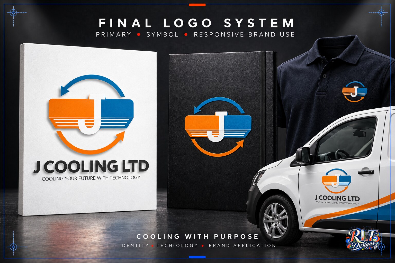
The completed logo provides a flexible system for both full-colour and simplified applications. It has been visualised across workwear, vehicles and printed materials to demonstrate how the identity can remain consistent throughout the business.

Have something in mind?