
Graphic Design · 2026
The Beigel Boys Double Sided Business Cards
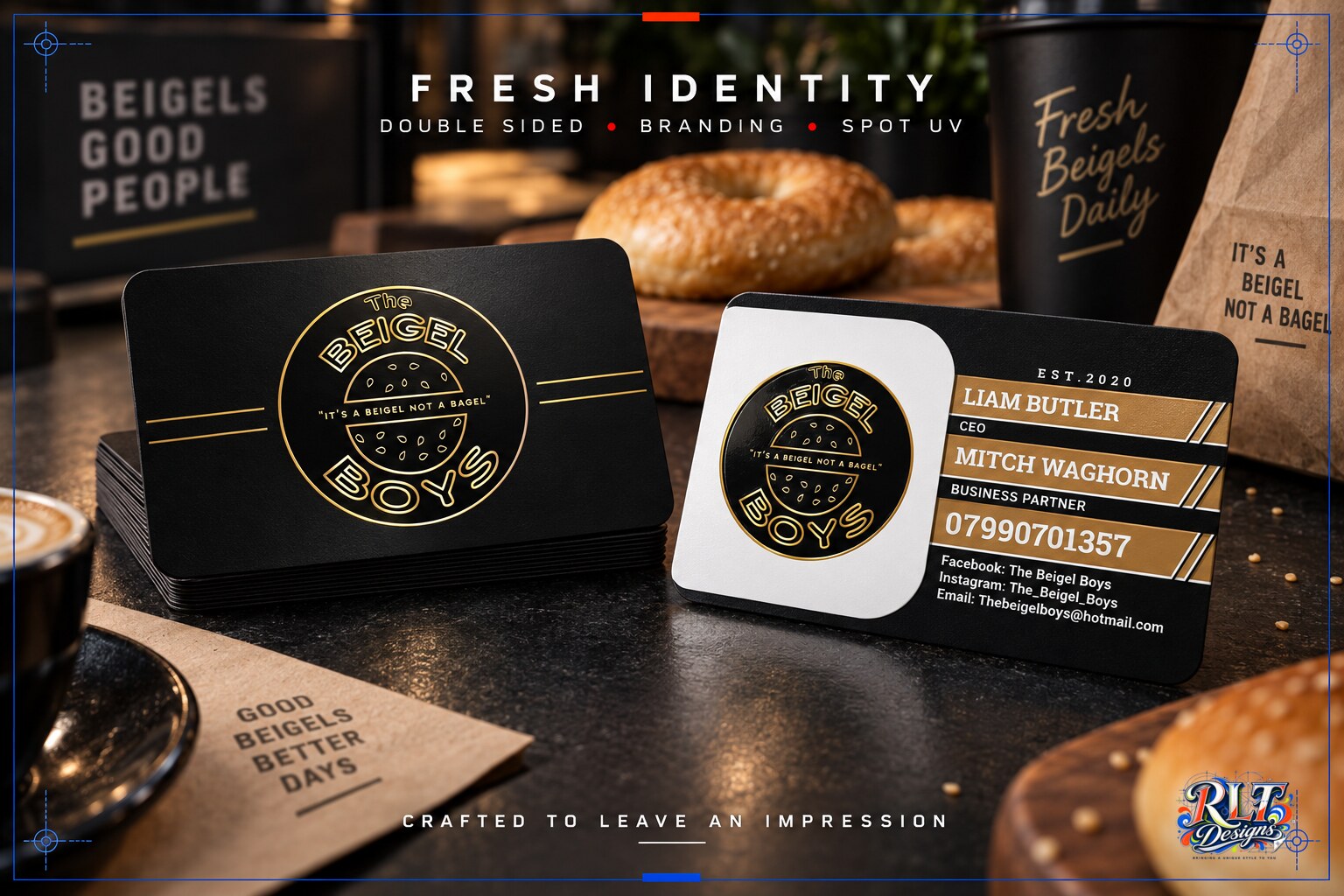
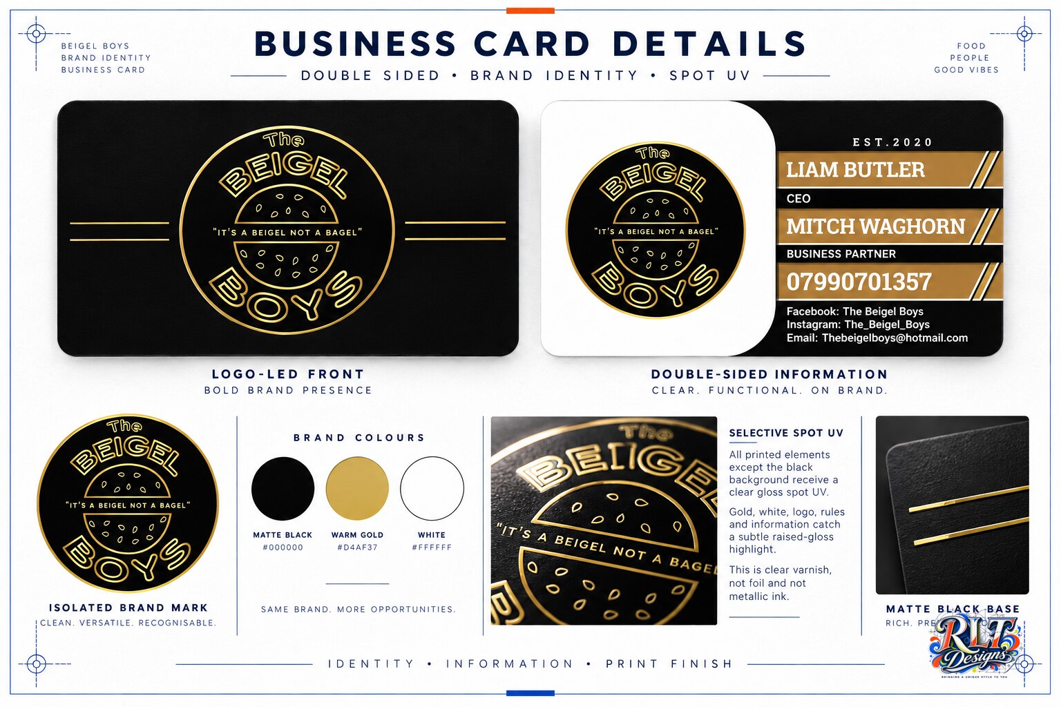
Black and gold business cards for The Beigel Boys, finished with spot UV across every element except the background.
Branding / Loyalty Cards / Business Cards
Behind the work
Project story
The Beigel Boys required double-sided business cards that could carry the personality of the food brand while providing clear contact information for both business partners. The card needed to feel distinctive and use its specialist finish with purpose.
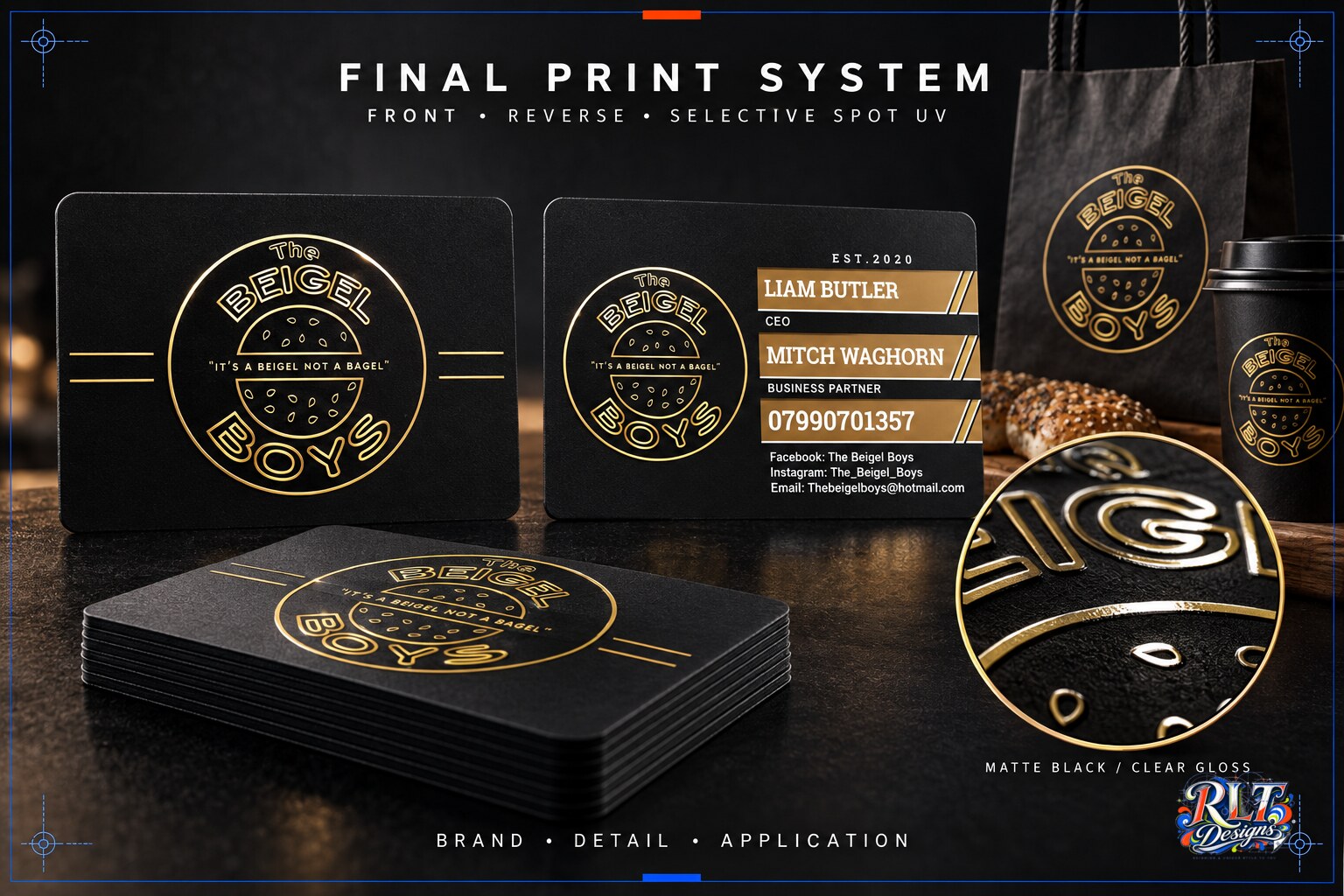
I built the design around the circular Beigel Boys logo, the black, white and warm-gold colour palette, and the line ‘It’s a beigel not a bagel’. The front keeps the brand mark central, while the reverse organises names, roles, phone and social details. Spot UV was applied to every printed element apart from the black background, creating a controlled gloss contrast across the card.
The finished cards give the business a memorable introduction while remaining practical for enquiries and events. The print finish reinforces the gold identity details and adds depth without introducing another colour or material.
Have something in mind?